A s a photographer there’s a whole host of tools available to me including: composition, awareness of lighting, posing, the exposure triangle and of course colour!
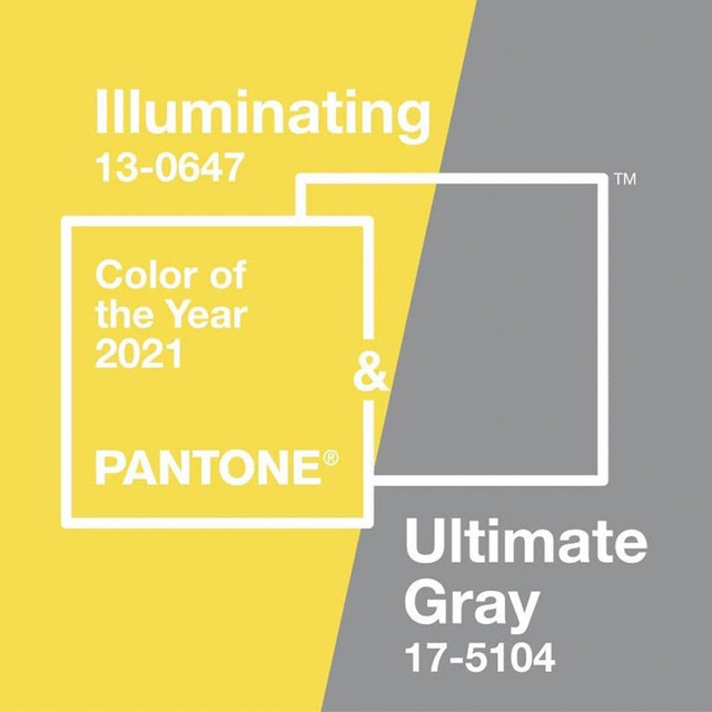
So it’s no surprise that one of my go-to sources for colour inspiration is The Pantone Colour Institute and their ‘Colour of the year’. A colour chosen annually reflecting the current global ‘mood’, influencing the worlds of fashion and design for the year ahead.
This year PANTONE have selected not one, but TWO colours for the year ‘Ultimate Grey’ and ‘Illuminating’. A striking combination which, according to colour psychology, conveys a message of strength and hopefulness. After 2020 I’m pretty sure we are all more than ready to embrace an element of security and the optimism of something more joyful to come!

Both colours are easy to incorporate into your colour palette for your next photography session. Use them as inspiration when considering location, styling your wardrobe and even when deciding where you’ll display your finished images.
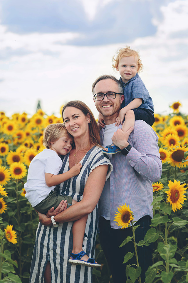
With the long awaited Spring approaching I’m looking forward to feasting my eyes over fields of daffodils. Closely followed by rapeseed and sunflower fields as we head into Summer. For these sessions, I recommend styling your wardrobe with shades of ‘Ultimate Grey’, whites and blue to balance the intensity of the yellow in your images.

Of course, living in the UK it’s reasonable to expect the occasional grey day. By introducing a pop of yellow and these images will be transformed from drab to joy. For example, wearing a pair of cheerful yellow wellies and rain mac whilst splashing in puddles. I can’t think of a more joyful image!
With the beaches of Southsea, Hayling and Witterings nearby many of my clients choose the coast as a backdrop for their images. The soft blue of the sea along with the pebbles and sand replicating all ’50 shades of grey’ create the perfect portrait canvas. Without colourful distractions you’ll find most colour palettes work well in this location.
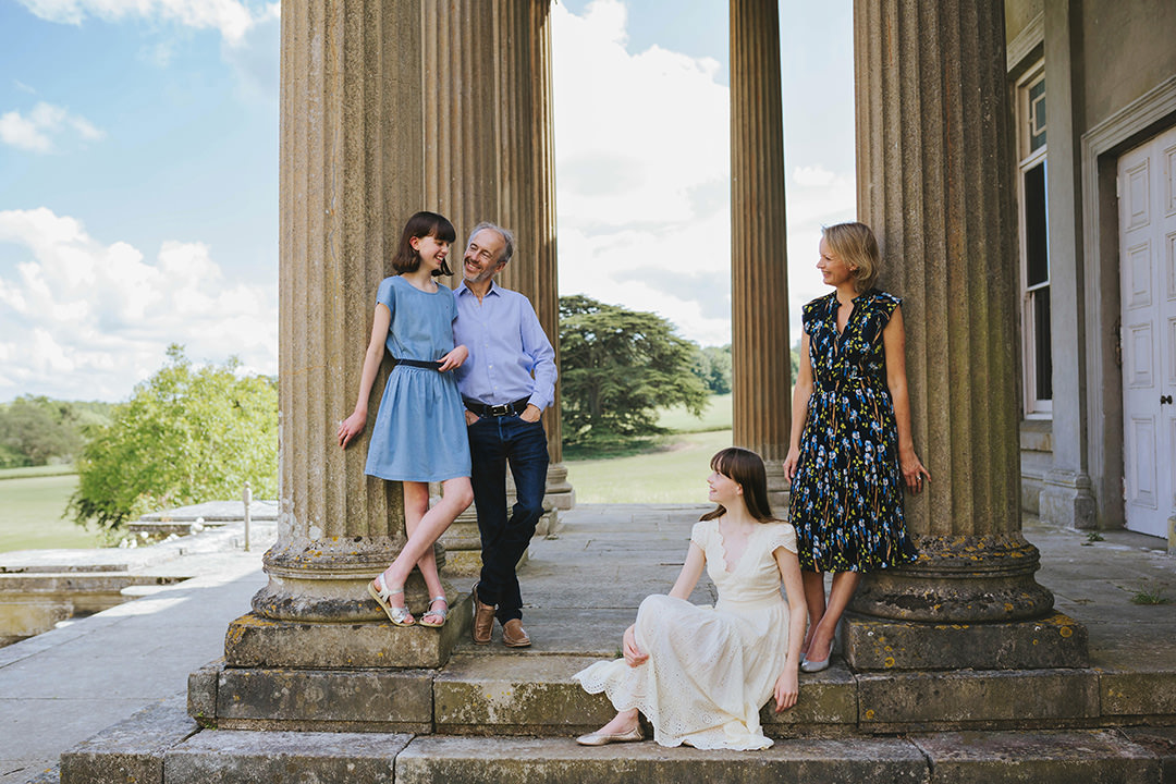
Similarly, urban backdrops with their grey pavements and the weathered stone walls of historical buildings partner beautifully with most palettes including yellow.

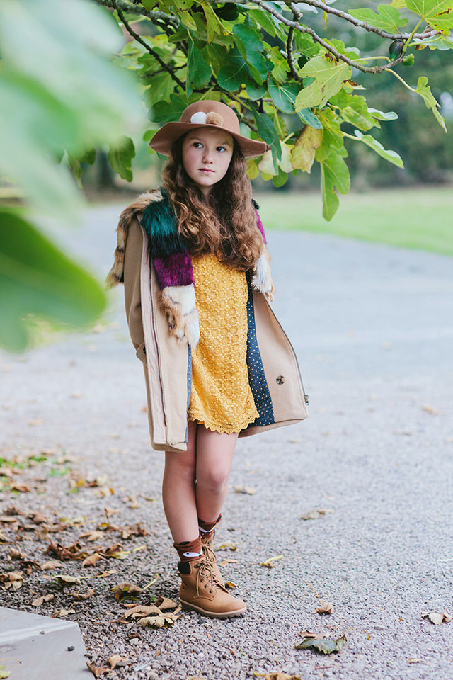
Whilst illuminating yellow isn’t for everyone as a block colour it’s still possible to include it in your palette. Choose clothing which features it less strongly, within a pattern for example. Then co-ordinate it with a softer shade as a block colour in another item of your family’s wardrobe. Or team your outfits with yellow belts, scarves and hair accessories.


Bearing in mind the influence PANTONE colour of the year has on design, it’s likely home decor will feature these too. So if you’re looking to refresh rooms with pops of grey or yellow consider displaying images featuring these colours. They’ll work in harmony with the rest of the room, becoming a cohesive element of your decor.
Above all the most important thing is that your images reflect you and your family, featuring locations special to you with colours you love and in a wardrobe you feel both comfortable and fabulous in.
For more inspiration visit my pinterest and instagram pages.
Feeling Inspired?
If you’re looking to book a family session and not sure where to start, get in touch and enjoy a fully customised session – I’d love to hear from you!


Recent Comments